dp and sp in Android UI Design
 When it comes to Android development, designing a user interface (UI) that looks great on all devices can be challenging. Android devices come in a wide variety of screen sizes and densities, making it crucial for developers to use scalable and adaptable units of measurement. Two key units used in Android UI design are dp (density-independent pixels) and sp (scale-independent pixels). This blog will delve into what these units are, why they are important, and how to use them effectively in your Android projects.
What is dp (Density-Independent Pixels)?
Overview
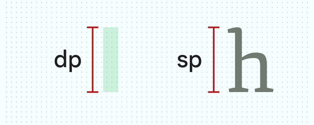
Density-independent pixels, abbreviated as dp or dip, are a flexible unit of measurement that helps maintain consistent sizing across different screen densities.Key Points
- Consistency: dp is designed to ensure that UI elements have the same physical size on different devices, regardless of screen density.
- Calculation: 1 dp is equivalent to one physical pixel on a screen with a density of 160 dpi (dots per inch). On higher density screens, the system scales dp units to maintain the same physical size.
- Usage: dp is typically used for defining dimensions, margins, padding, and positioning of UI elements.
Why It’s Important
Using dp helps ensure that your UI looks consistent across various devices. This consistency improves user experience by providing a predictable and uniform interface, regardless of the device being used.What is sp (Scale-Independent Pixels)?
Overview
Scale-independent pixels, abbreviated as sp, are similar to dp but also consider the user’s font size preferences.Key Points
- Font Scaling: sp scales according to both the screen density and the user’s preferred text size. This makes it ideal for specifying font sizes.
- Calculation: 1 sp is equivalent to 1 dp at the default font size setting, but it scales according to the user’s font size preference.
- Usage: sp is primarily used for text sizes to ensure readability and accessibility.
Need testing? – Try RobotQA and Start Testing on Real Devices. Start Free Trial
Why It’s Important
Using sp for text sizes ensures that your application respects user preferences for font size, which is crucial for accessibility. This adaptability helps create a more user-friendly and inclusive experience.How to Use dp and sp in Android Development
Defining Dimensions in XML
When defining dimensions in XML layouts, use dp for layout dimensions and margins, and sp for text sizes. Here’s an example:<LinearLayout
xmlns:android="http://schemas.android.com/apk/res/android"
android:layout_width="match_parent"
android:layout_height="match_parent"
android:padding="16dp">
<TextView
android:layout_width="wrap_content"
android:layout_height="wrap_content"
android:text="Hello, World!"
android:textSize="18sp"
android:marginBottom="8dp"/>
<Button
android:layout_width="wrap_content"
android:layout_height="wrap_content"
android:text="Click Me"
android:padding="10dp"/>
</LinearLayout>
In this example:
- The padding and margin are defined in dp to ensure consistent spacing across different screen densities.
- The textSize is defined in sp to respect the user’s font size preferences.
Programmatically Setting Dimensions
You can also set dimensions programmatically in your Java or Kotlin code:val textView = TextView(this)
textView.textSize = 18 * resources.displayMetrics.scaledDensity
textView.setPadding(
(16 * resources.displayMetrics.density).toInt(),
(16 * resources.displayMetrics.density).toInt(),
(16 * resources.displayMetrics.density).toInt(),
(16 * resources.displayMetrics.density).toInt()
)
In this example:
scaledDensityis used for setting text size in sp.densityis used for setting padding in dp.
Best Practices
- Use dp for Layout: Always use dp for defining the size and spacing of UI elements to ensure consistency across different screen densities.
- Use sp for Text: Always use sp for defining text sizes to respect user preferences and improve accessibility.
- Test on Multiple Devices: Test your app on different devices and screen sizes to ensure that your UI scales properly.
- Use ConstraintLayout: Consider using ConstraintLayout to create flexible and responsive layouts that adapt to different screen sizes and orientations.
- Accessibility Considerations: Always keep accessibility in mind by using appropriate text sizes and ensuring that your UI is navigable and readable for all users.